IGNIK
The branding, color combinations, and finish details are rooted in stories surrounding adventuring and eating in the wild outdoors. The final products turned out awesome.
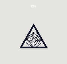
IGNIK LOGO:
FINAL DESIGN &
EARLY CONCEPTS
The objective was to create a logo for IGNIK, a sustainable outdoor heat company creating re-usable propane tanks and other heating solutions for consumers.
I explored various ways "FIRE" had been represented as an icon throughout history. Early humans, nomadic peoples, and even train hoppers have used graphic markings to communicate and represent
The triangle outline surfaced as a theme across multiple cultures designating "FIRE"... see the exploration below for the LOGO, BRAND DIRECTION, and PRODUCT DESIGN.


IGNIK BRAND DEV:
COLOR AND GRAPHIC
DEVELOPMENT
With Logo direction finalized and initial phases of brand color established I explored and ideated color, branding, and early product sketching. Below are snippets from my process. This took about 2-3 rounds with the Ignik team to accept a pallet and guide visual brand language direction.
IGNIK PRODUCT:
COLOR AND GRAPHIC
APPLICATION
With the Ignik team I helped develop a visual way to identify "heatzones" on floor heating for sleeping pads, heat pads, and blankets.I helped edit product graphic packs and provided options for product badging rooted in the previous brand stories that gave guidance to the visual brand language.
It was an honor to work with the IGNIK team from Branding to Products that will hopefully help change the world for the better.


.jpg)

_jp.jpg)


